Branded Mobile App
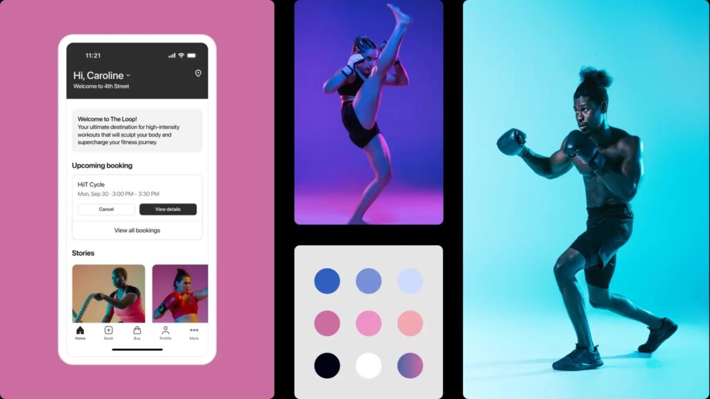
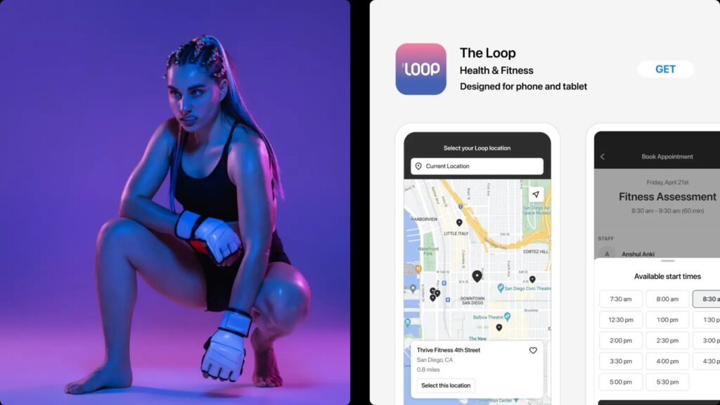
The branded mobile app project, aimed at improving user experience for Mindbody business clients and customers, focused on a comprehensive visual refresh and modernization, guided by customer feedback and intensive research. This personalized app not only amplifies brand exposure but also facilitates enhanced client connectivity, thereby providing users with an alternate, more seamless way to engage with their services.
Role:
Product Designer
Responsibilities:
Product strategy, User research, Prototyping & Testing, Interaction & Visual design
Project Duration:
5 Months
Project Objective:
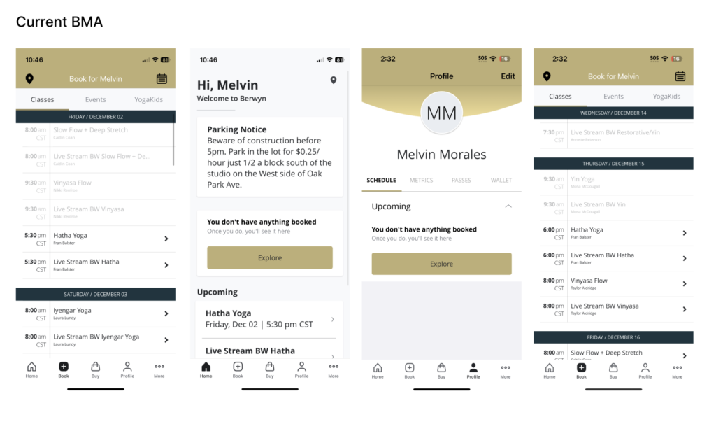
The Mindbody Branded Mobile App UI Redesign aimed to modernize and update the existing app, which had not undergone significant changes in over four years. Collaborating closely with the Development team, the project sought to enhance the overall user experience and align the app with current design trends.
Research and Inspiration:
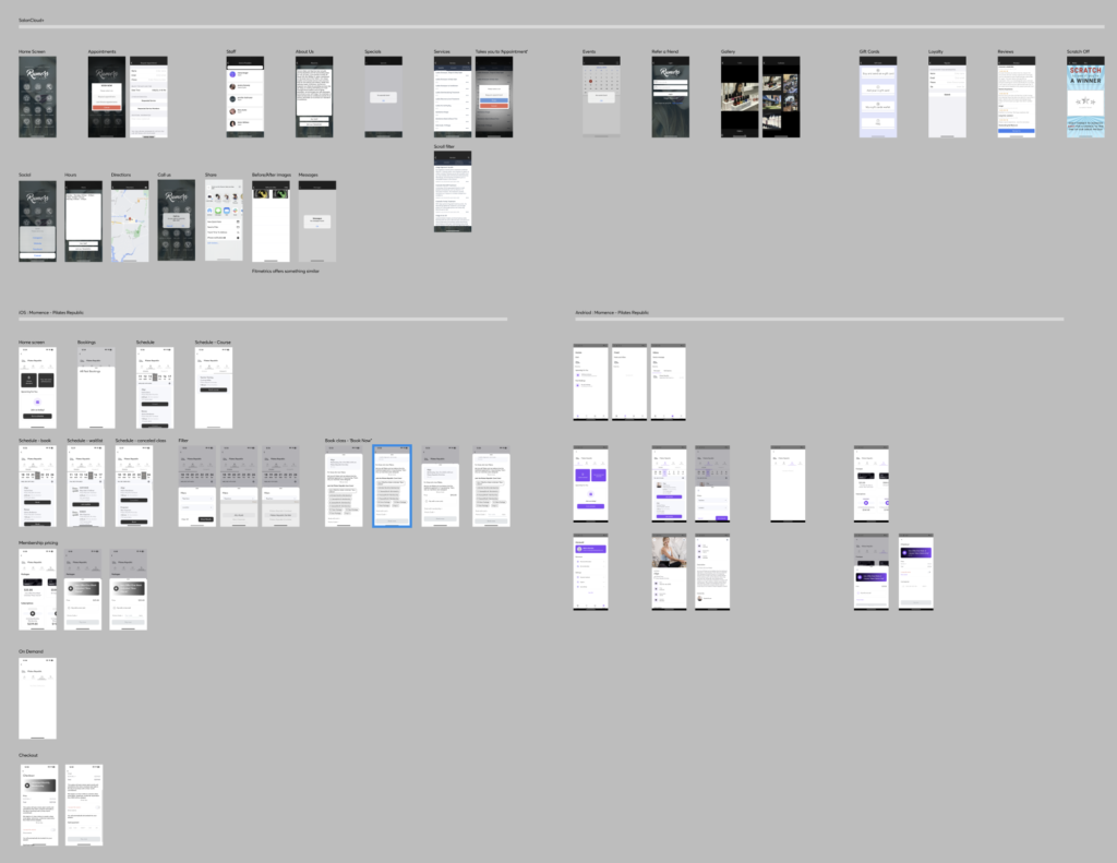
Extensive competitor analysis and market research was conducted to identify current design trends and user preferences. Existing pages within the app were evaluated, and inspiration was drawn from leading apps in various industries to inform the redesign.
Concept Development:
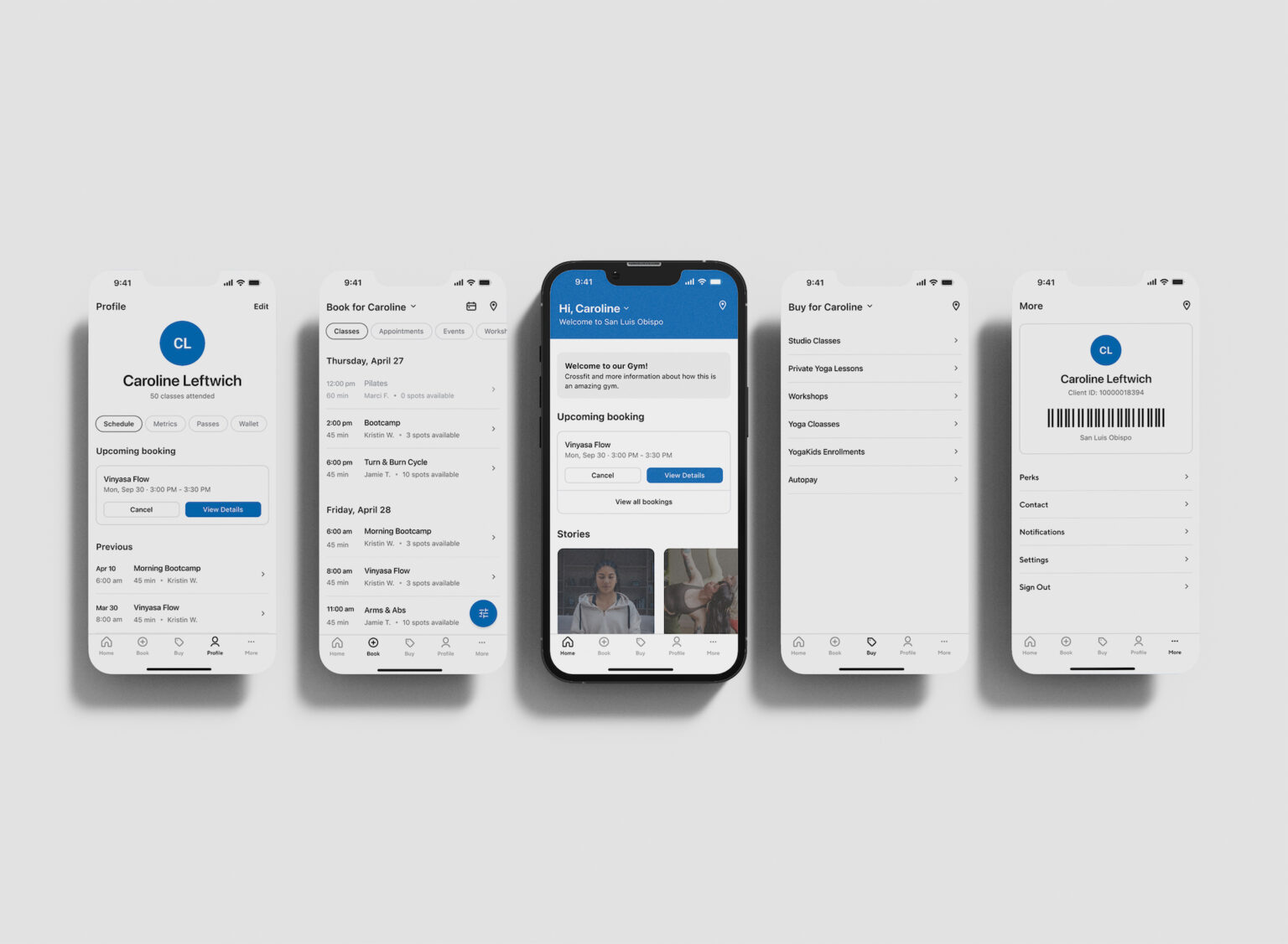
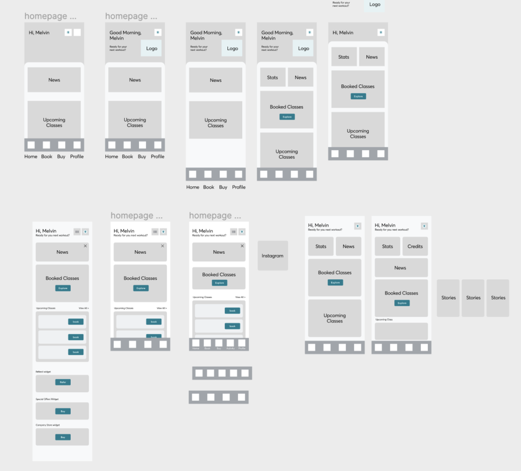
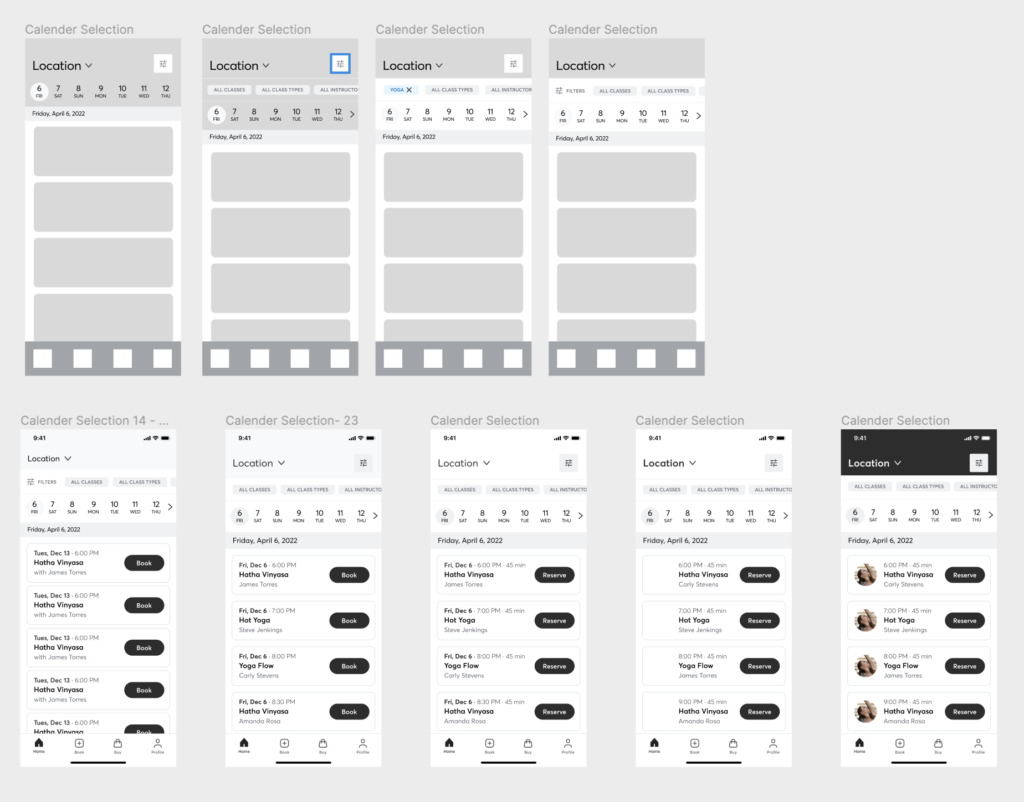
The redesign approach involved a meticulous examination of every page within the app. Brainstorming sessions and collaborative discussions with the Development team informed the creation of a detailed redesign plan. Each page was updated one by one to ensure a comprehensive overhaul.
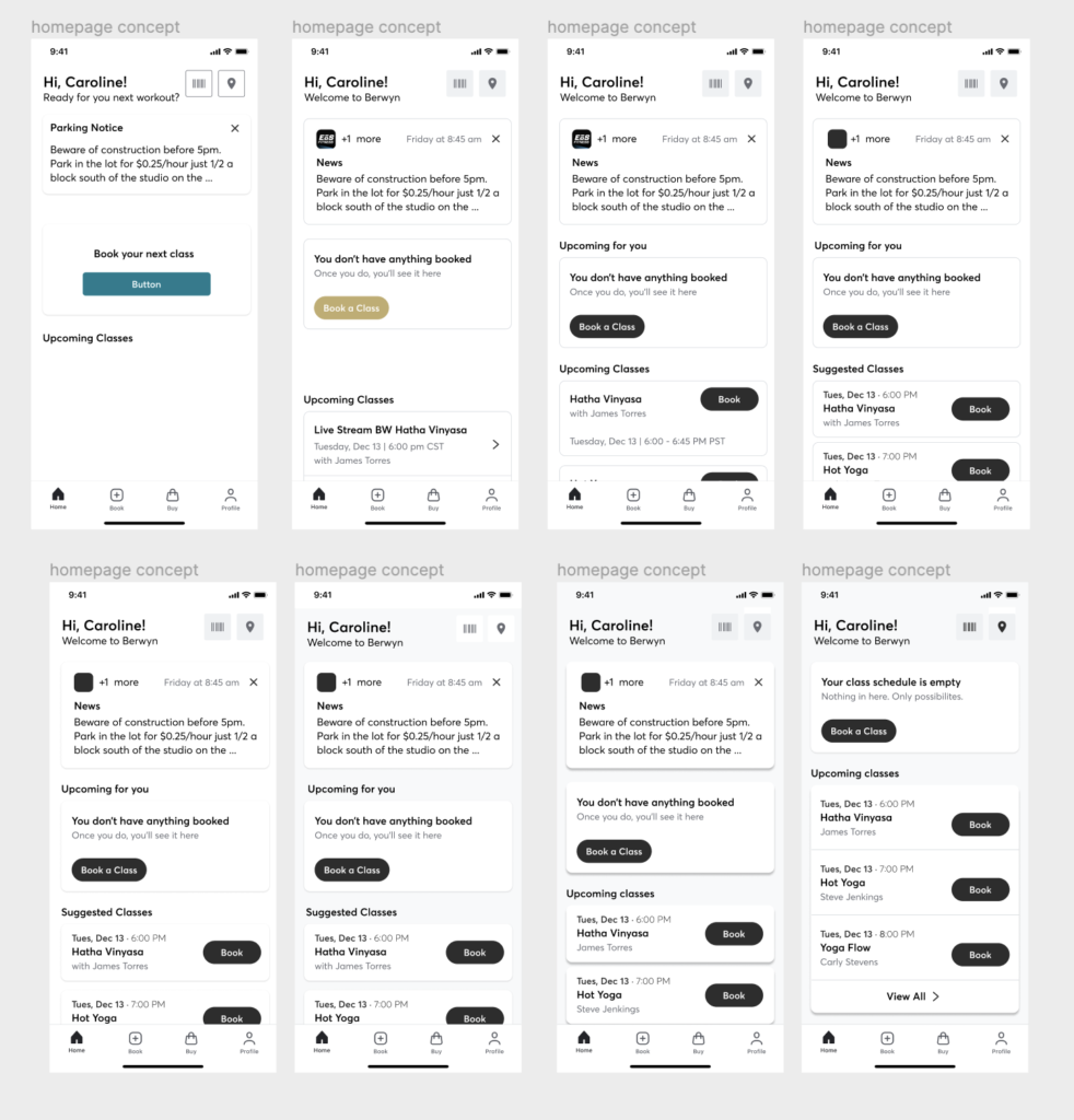
Design System and Style Guide:
A comprehensive design system and style guide were developed to maintain consistency throughout the app. Typography, color palette, iconography, and UI components were documented, ensuring a harmonious visual identity across all pages.
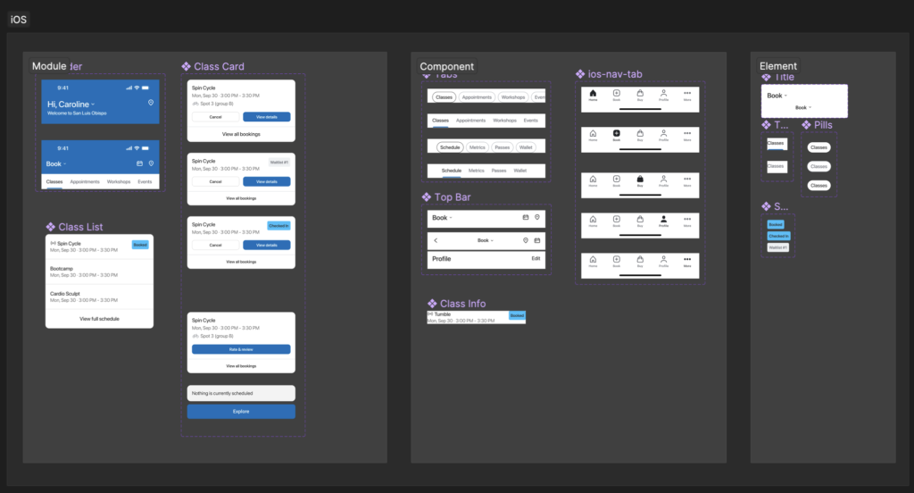

User Experience (UX):
User experience was a central focus throughout the redesign process. User flow diagrams, journey maps, and wireframes guided the updated navigation and interactions. Collaborative efforts with the Development team ensured seamless implementation of user-centric design choices.
Project Outcomes and Metrics:
- Modernized app interface resulted in increased user engagement and positive feedback.
- Improved user satisfaction through intuitive navigation and contemporary design elements.
- Use Pendo to track user metrics
- User Research to follow up
- Continue tracking app engagement and usage, especially for bookings
Testimonials and Client Feedback:
“The Mindbody Branded Mobile App’s new look and feel are fantastic! The updated design makes navigation a breeze, and the modern aesthetic is a welcome change.” – Client from Research Study
Lessons Learned and Future Improvements:
The project highlighted the importance of regular updates to stay current with design trends and user expectations. Collaborative efforts with the Development team demonstrated the value of cross-functional collaboration. Future iterations could focus on incorporating AI-driven personalization and further optimizing user interactions.
This UI redesign project demonstrates the commitment to delivering an enhanced user experience through a comprehensive update of the Mindbody Branded Mobile App. The collaboration between design and development has resulted in a visually appealing and user-friendly application that aligns with modern design standards.
Location Selection Re-Design:
In addition to the comprehensive UI redesign of the Mindbody Branded Mobile App, the Location Selection feature underwent a transformation to enhance user experience and streamline studio or business selection.
Overview:
The Location Selector feature empowers users to seamlessly switch between different studios or businesses associated with their account. This functionality is vital for checking class schedules, pricing options, and accessing more information relevant to the selected location.
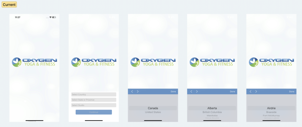
Current View: A Frustrating Experience:
Prior to the redesign, the location selection process was a cumbersome experience. Users were required to navigate through three drop-down menus—country, state, and city—to choose their desired studio or business. This tedious process often resulted in frustration and discouraged engagement.
Concept Development:
The concept development phase involved a thorough analysis of the existing location selection screens. The goal was to modernize the experience and alleviate the frustration caused by the multi-step drop-down selection. To address these challenges, two key concepts were explored:
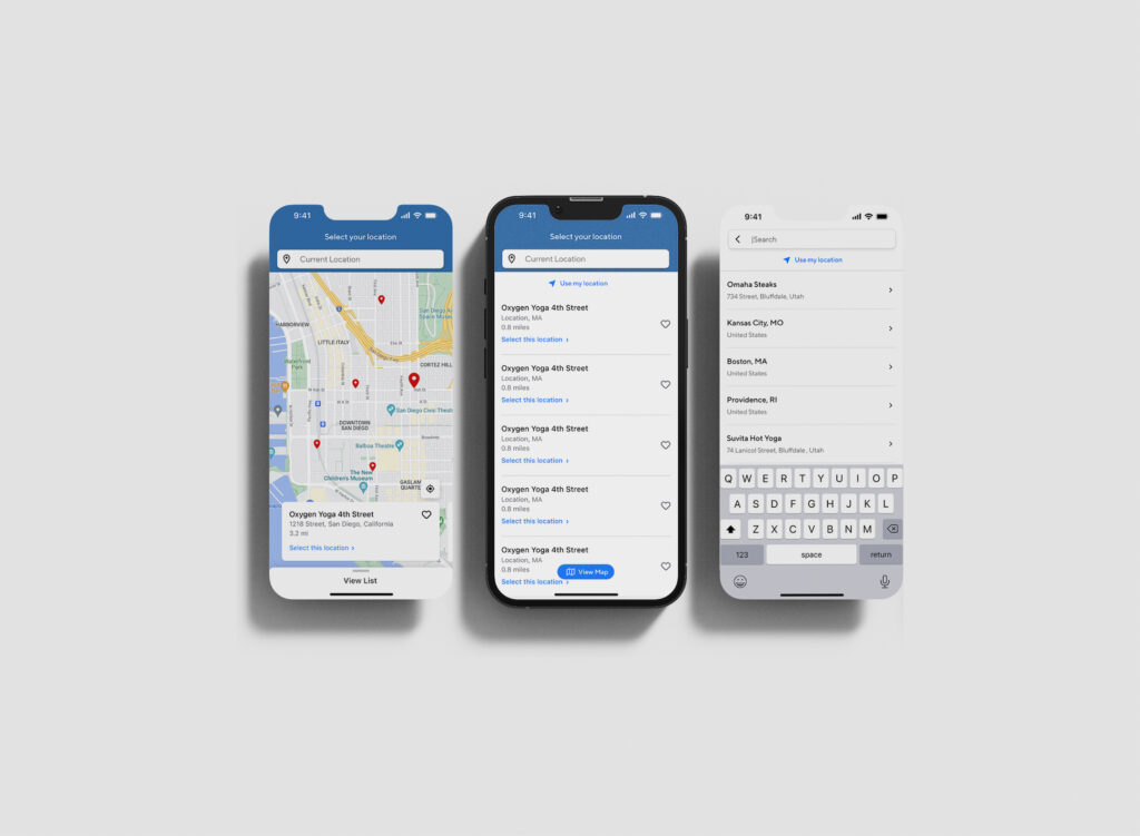
List View: A user-friendly list view was introduced, enabling users to quickly scroll through available studios or businesses. This intuitive approach eliminated the need for multiple drop-downs, improving accessibility and reducing user effort.
Map View: To provide users with a spatial perspective, a map view option was integrated. Users could now visualize the proximity of different studios or businesses and gauge their approximate distance. This approach enhanced user engagement and added a dynamic element to the location selection process.
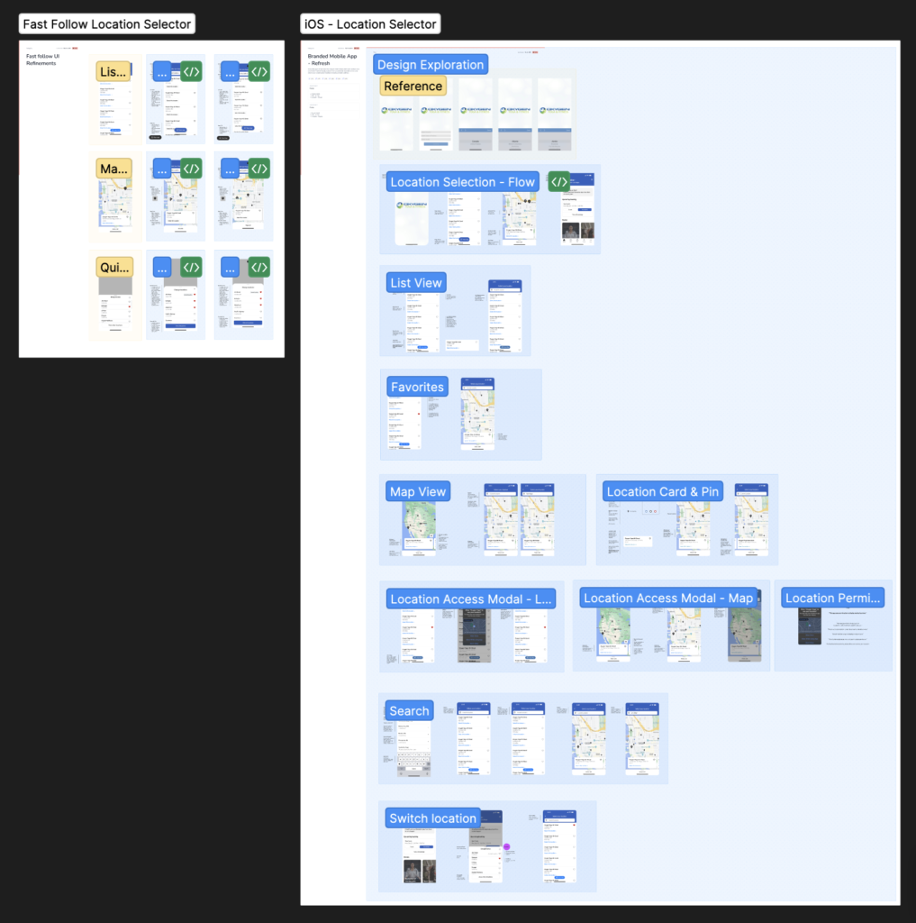
User Experience (UX):
The final design merged the innovative concepts of list view and map view, presenting users with a modernized and user-centric experience. Upon accessing the Location Selector, users were greeted with a clear, concise list of available studios or businesses, allowing them to swiftly make a selection.
The map view, an integral part of the redesign, enabled users to visually identify the location’s proximity and choose a studio or business that suits their preferences. This dynamic interaction provided users with a new level of engagement and convenience.
The redesigned Location Selection feature not only streamlined the process but also enhanced user satisfaction by minimizing effort and maximizing accessibility. This solution aligns with the overall goal of the UI redesign project—creating a seamless, enjoyable experience for users of the Mindbody Branded Mobile App.
